UX Case Study
UX Case Study
Improving the Post-Onboarding Experience for a Web App platform
Improving the Post-Onboarding Experience for a Web App platform
SaaS CRM for Freelancers & Solopreneurs.
SaaS CRM for Freelancers & Solopreneurs.

Industry
SaaS CRM for Freelancers & Solopreneurs
SaaS CRM for Freelancers & Solopreneurs
Product Type
Product Type
Web App
Web App
Web App
Deliverables
Deliverables
UX Strategy
Research
User Testing
UX Redesign
Design System updation
Role
Lead UX Design Engineer
Lead UX Design Engineer
Timeline
Timeline
6 Months
6 Months
Tools & Methods
Tools & Methods
Figma
Notion
Design Thinking
User Interviews
Usability Testing
The Problem
The Problem
Our Web App is struggling with conversions & customer retention!!
Our Web App is struggling with conversions & customer retention!!

CEO & Founder
CEO & Founder
Self -Notes
“Legacy product, needed a careful UX strategy , lessening the complex feature structure, overwhelming IA for the desired outcomes!”
Sonal - Team Lead UX
“Legacy product, needed a careful UX strategy , lessening the complex feature structure, overwhelming IA for the desired outcomes!”
Sonal - Team Lead UX
The Plan
The Plan
1
1
1
Research methodologies, user interviews.
Research methodologies, user interviews.
Research methodologies, user interviews.
2
2
2
Market Overview & Landscape.
Market Overview & Landscape.
Market Overview & Landscape.
3
3
3
Competitive Positioning, Business value for each feature change.
Competitive Positioning, Business value for each feature change.
Competitive Positioning, Business value for each feature change.
4
4
4
Strategic Recommendations.
Strategic Recommendations.
Strategic Recommendations.
Constraints
Constraints
Every redesign exists inside a web of constraints. Naming them honestly — before a single pixel moves — is what separates strategy from wishful thinking.
Every redesign exists inside a web of constraints. Naming them honestly — before a single pixel moves — is what separates strategy from wishful thinking.
Constraints were surfaced from five sources:
01 Stakeholder interviews with Moxie’s product, engineering, and customer success leads.
02 User research /Interviews
03 Technical audit of Moxie’s existing component library and data architecture
04 Competitive analysis of six alternatives (HoneyBook, Dubsado, Bonsai, Plutio…)
05 Review aggregation from Trustpilot, e.t.c(Direct channel user feedbacks.)
For this CRM redesign, this particular document was produced before wireframes, before prototypes, before any pixel moved. It became the filter through which every design decision was passed.
01 Budget & Financial Constraints
02 Legacy Users & Change Resistance
03 Technical & Architectural Constraints
-The existing component library is
tightly coupled to the current
navigation structure
04 Strategic Recommendations.
For this CRM redesign, this particular document was produced before wireframes, before prototypes, before any pixel moved. It became the filter through which every design decision was passed.
01 Budget & Financial Constraints
02 Legacy Users & Change Resistance
03 Technical & Architectural Constraints
-The existing component library is tightly coupled to the current navigation structure
04 Strategic Recommendations.
Project Overview
Project Overview
The App provides freelancers and solopreneurs with a unified workspace to manage clients, projects, contracts, invoices, scheduling, forms, and business operations.
The onboarding experience successfully brings users into the product. However, analytics and qualitative feedback indicate that users experience friction after account creation, where they are expected to adopt multiple features and establish long-term workflows.
The objective was therefore not to improve onboarding, but to improve the product experience immediately after onboarding—where engagement, habit formation, and feature adoption determine long-term retention.
The App provides freelancers and solopreneurs with a unified workspace to manage clients, projects, contracts, invoices, scheduling, forms, and business operations.
The onboarding experience successfully brings users into the product. However, analytics and qualitative feedback indicate that users experience friction after account creation, where they are expected to adopt multiple features and establish long-term workflows.
The objective was therefore not to improve onboarding, but to improve the product experience immediately after onboarding—where engagement, habit formation, and feature adoption determine long-term retention.
Problem Statement
Problem Statement
Problem Statement
❚
As a result..
As a result..
Inconsistent feature adoption.
Slower Activation
Navigation Friction
Cognitive Overload
Reduced Long term Engagement.
Inconsistent feature adoption.
Slower Activation
Navigation Friction
Cognitive Overload
Reduced Long term Engagement.
Hence - The Design Challenge :-
Hence -
The Design Challenge :-
"How might we create a post-onboarding experience that adapts to different user behaviors while reducing cognitive load and increasing feature adoption?"
"How might we create a post-onboarding experience that adapts to different user behaviors while reducing cognitive load and increasing feature adoption?"
The Research
Research Methods
Research Methods
Research Methods
1
Primary Research
Contextual Interviews
25 Participants
Questions explored
What was your first task after signing up?
What slowed you down?
Which feature did you expect?
What surprised you?
Which features did you ignore?
Usability Testing
Usability Testing
Usability Testing
2
Participants completed
Create Client
Create Project
Send Contract
Send Invoice
Schedule Meeting
Measurements
Success Rate
Time
Errors
Hesitation
Navigation Paths

User Insights -
User Insights -
UX Analysis • Power User Feedback • Strategic Recommendations
UX Analysis • Power User Feedback • Strategic Recommendations
⚠️
⚠️
Critical Pain Points
Critical Pain Points
HIGH
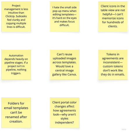
Project Management Workflow
Missing task dependencies, unintuitive task creation, clunky subtasks
Project Management Workflow
Missing task dependencies, unintuitive task creation, clunky subtasks.
HIGH
UI/UX Consistency Issues
Small pop-up menus, floating interfaces, accessibility concerns
UI/UX Consistency Issues
Small pop-up menus, floating
interfaces, accessibility concerns
MEDIUM
Data Integration Gaps
Custom fields don't transfer between modules, manual re-entry required
Data Integration Gaps
Custom fields don't transfer between modules, manual re-entry required
"Strong dislike for the small, pop-up side menu... especially for users with accessibility issues / Neuro - Divergence.”
"Strong dislike for the small, pop-up side menu... especially for users with accessibility issues / Neuro - Divergence.”
🚀
Strategic Opportunities/ Recommendations
Strategic Opportunities
Strategic Opportunities/ Recommendations
🎯 Visual Hierarchy Improvements
Impact: High | Effort: Low
Replace client icons with names in table views
🎯 Visual Hierarchy Improvement
Impact: High | Effort: Low
Replace client icons with names in table views
🎯 Visual Hierarchy Improvements
Impact: High | Effort: Low
Replace client icons with names in table views
♿ UI Accessibility Upgrades
Impact: High | Effort: Medium
Larger, centralized editing interfaces
♿ UI Accessibility Upgrades
Impact: High | Effort: Medium
Larger, centralized editing interfaces
🔗 Advanced Project Management
Impact: High | Effort: High
Task dependencies, bulk operations, workflow automation
🔗 Advanced Project Management
Impact: High | Effort: High
Task dependencies, bulk operations, workflow automation
️ Global Asset Management
Impact: Medium | Effort: Medium
Canva-style image gallery and template reusability
️ Global Asset Management
Impact: Medium | Effort: Medium
Canva-style image gallery and template reusability
Bridging the gap between the users and the platform:
Mapping out each flow and opportunities
Bridging the gap between the users and the platform:
Mapping out each flow and opportunities
Bridging the gap between the users and the platform:
Mapping out each flow and opportunities

Framework
Framework
Framework
How we formed our strategy and what Design frameworks helped:
Observational UX Research naturally gave way to Task Analysis and hence JTBD framework came into play though eventually combined with Design Thinking !!
How we formed our strategy and what Design frameworks helped:
Observational UX Research naturally gave way to Task Analysis and hence JTBD framework came into play though eventually combined with Design Thinking !!

Navbar IA changes : Navigation Optimization
Following user research, heuristic evaluation, and stakeholder workshops, the left navigation was restructured to improve information discoverability, reduce cognitive load, and better align with users' primary workflows. The proposed IA was reviewed with cross-functional stakeholders and approved for implementation after validating its impact on task efficiency and product scalability.
Key Changes Accepted:
Navbar IA changes : Navigation Optimization
Following user research, heuristic evaluation, and stakeholder workshops, the left navigation was restructured to improve information discoverability, reduce cognitive load, and better align with users' primary workflows. The proposed IA was reviewed with cross-functional stakeholders and approved for implementation after validating its impact on task efficiency and product scalability.
Key Changes Accepted:
Round 1: Information Architecture Exploration
Round 1: Information Architecture Exploration
Steps that I followed : Low-fidelity discovery mapping hierarchy structural ease of use.
Steps that I followed :
Low-fidelity discovery mapping hierarchy structural ease of use.

Final Approved Solutions :


Introduced AI Assistant